


 2026-08-31 09:50
 By KESONLY


Learning to See the Subtle Differences
Understanding color begins with a reliable grade, then becomes a conversation about the diamond you actually enjoy looking at.
Two diamonds sit beside each other on a neutral tray. At first, you see brightness, shape, and the movement of light. Only after looking for longer do you notice that one feels a little warmer. That slow adjustment is a useful place to begin: color can be subtle, and learning to observe it takes patience.
At KESONLY, we want the language surrounding jewelry to make a choice clearer. A color grade offers important information, but it should support your experience of a diamond rather than replace it.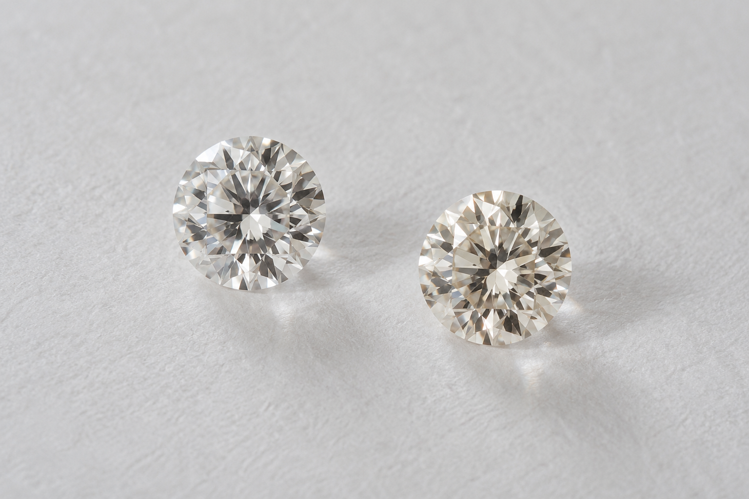
1. Understand What D-to-Z Describes
GIA's D-to-Z scale describes the depth of color within the normal diamond color range. D represents colorless; moving toward Z, the presence of light yellow, brown, or gray increases. GIA groups D-F as colorless, G-J as near colorless, K-M as faint, N-R as very light, and S-Z as light.
Color grading uses controlled viewing conditions and comparison stones with established grades. This is different from judging a diamond casually in a finished ring. Fancy color diamonds are evaluated using a different framework, so the D-to-Z scale should not be treated as a universal ranking for every diamond color.
2. Notice the Surroundings
A diamond reflects its environment, including the metal around it. Yellow or rose gold can introduce warmer reflections, while white metal creates a different visual relationship. The setting affects perceived appearance; it does not rewrite the diamond's documented color grade.
For a useful personal comparison, keep the surroundings consistent. Look at the stones together on the same neutral background, then consider them in the metal you prefer. Ask to see them under more than one ordinary lighting condition. A dazzling spotlight can be enjoyable, but you will also wear the piece in kitchens, offices, and quiet rooms.
3. Decide What Matters to Your Eye
Try describing your response before looking again at the letters. Do you prefer a cooler impression, or does a little warmth sit beautifully with your chosen gold? Are you noticing a difference at a normal viewing distance, or only when deliberately searching for it?
These questions do not replace a grading report. They help you use it in context. Compare the actual stones, ask which report belongs to each one, and consider the complete design. You do not need to invent a preference because a letter appears more impressive; you do need to understand what is being offered.
A thoughtful choice leaves room for both evidence and taste. Keep the documented grade, the surrounding metal, and your own observations in the same conversation. The result is a diamond selected with understanding, and jewelry whose beauty feels personal every time you wear it.
Bring Your Questions into Focus
Talk with KESONLYContinue reading:
The Color Trick · Diamond Clarity · Fancy-Color Diamonds